Track Subs
- Category: Mobile app design
- Duration: 30 days
- My Role: Sole UX Designer
- Design Tool: Figma
Introduction
This product will help users keep track of all products and services they subscribe to each month or year on the mobile applications.
Problem Statement
Problem
Users benefit from subscribing to different platforms such as Netflix, Hulu, and YouTube TV, but sometimes people may lose track of what they’re paying for. The user's lack of control over their subscriptions causes them to pay more.
Solution
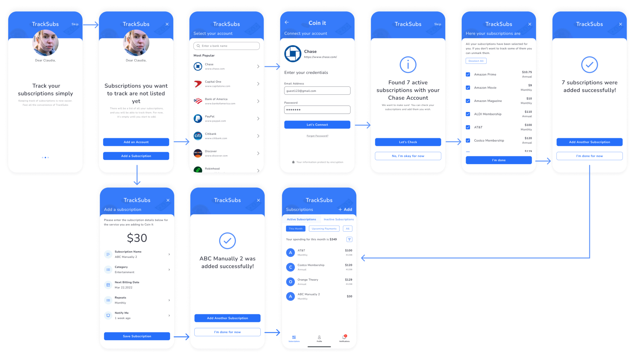
Users can add their subscriptions by adding a bank account to find their subscriptions automatically from its transactions or by adding them manually. Then, all the active and inactive subscriptions they have will be listed and filtered on that application. Also, they can get a notification before the payment day
Process
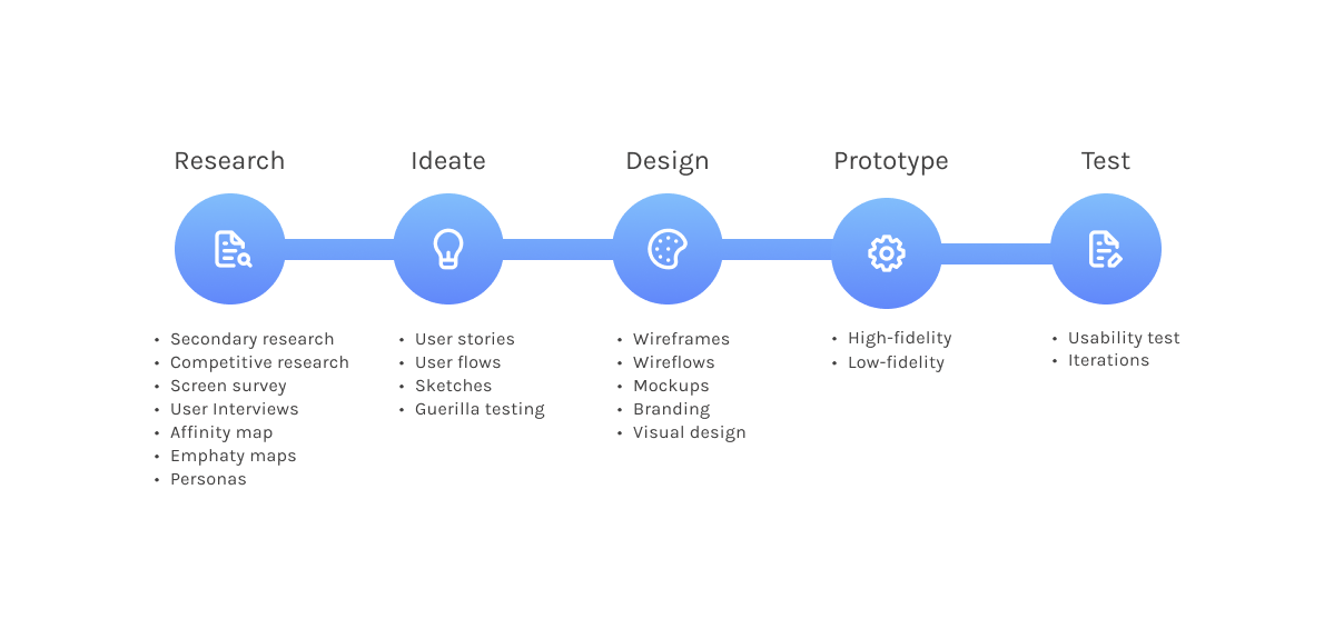
I adopted a modified version of IDEOS’s human-centered design thinking process while creating TrackSubs. It includes research, ideation, design, prototype, and test steps.
Research
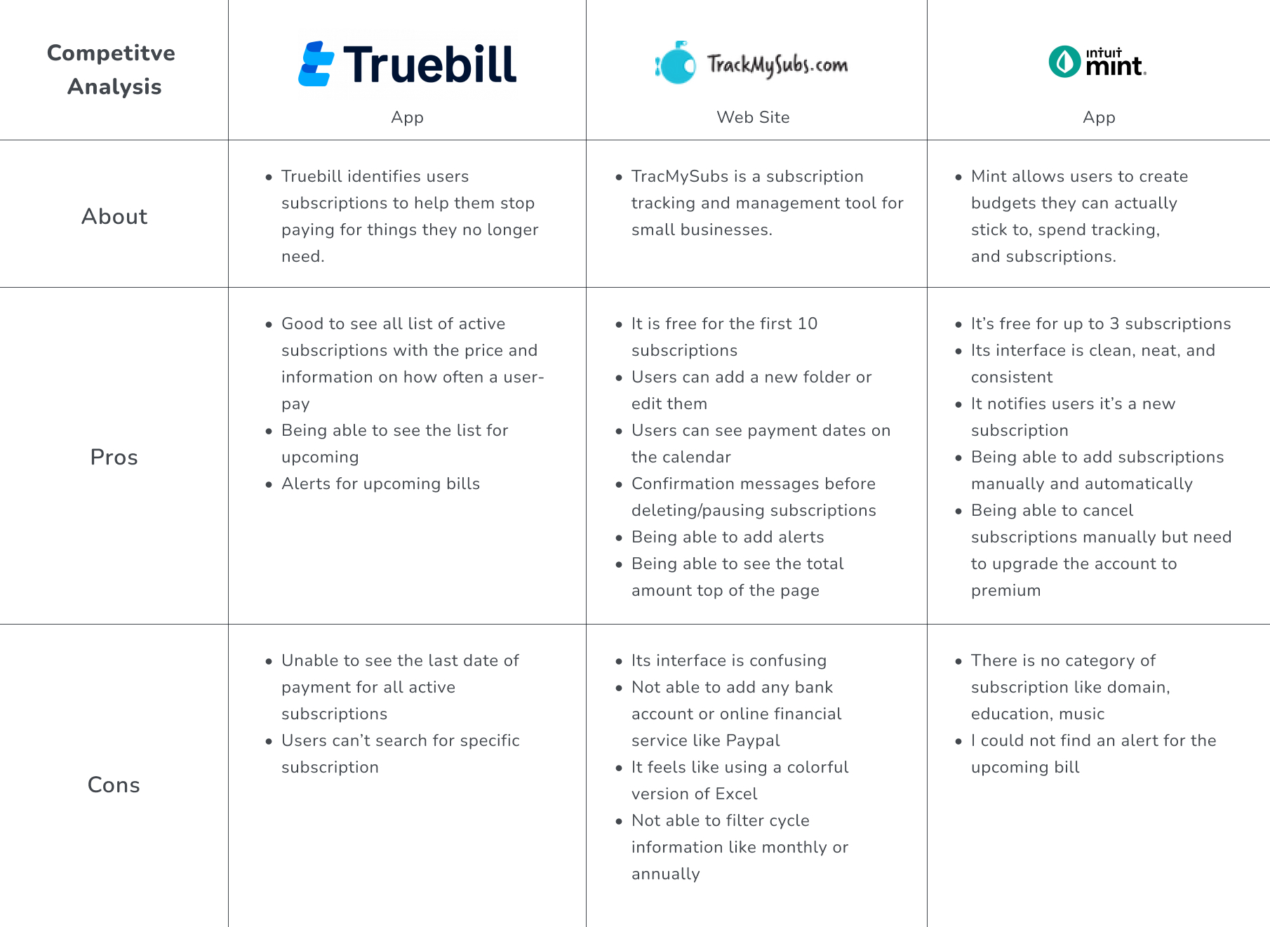
I benefited from many resources available to better understand the challenges users face when they want to track their subscriptions. I looked at how other products have solved similar problems for my competitive research.
In the industry, there are many applications or websites to keep track of subscriptions. I decided to study three industry leaders, TrueBill, TrackMySubs, and Mint to explore.
The Mint application allows users to not only track spending but also budget planning and credit monitoring.
The Mint could work for users the most, but I found its sitemap was confusing. I had a hard time finding subscriptions. You can find more of what I found else below.
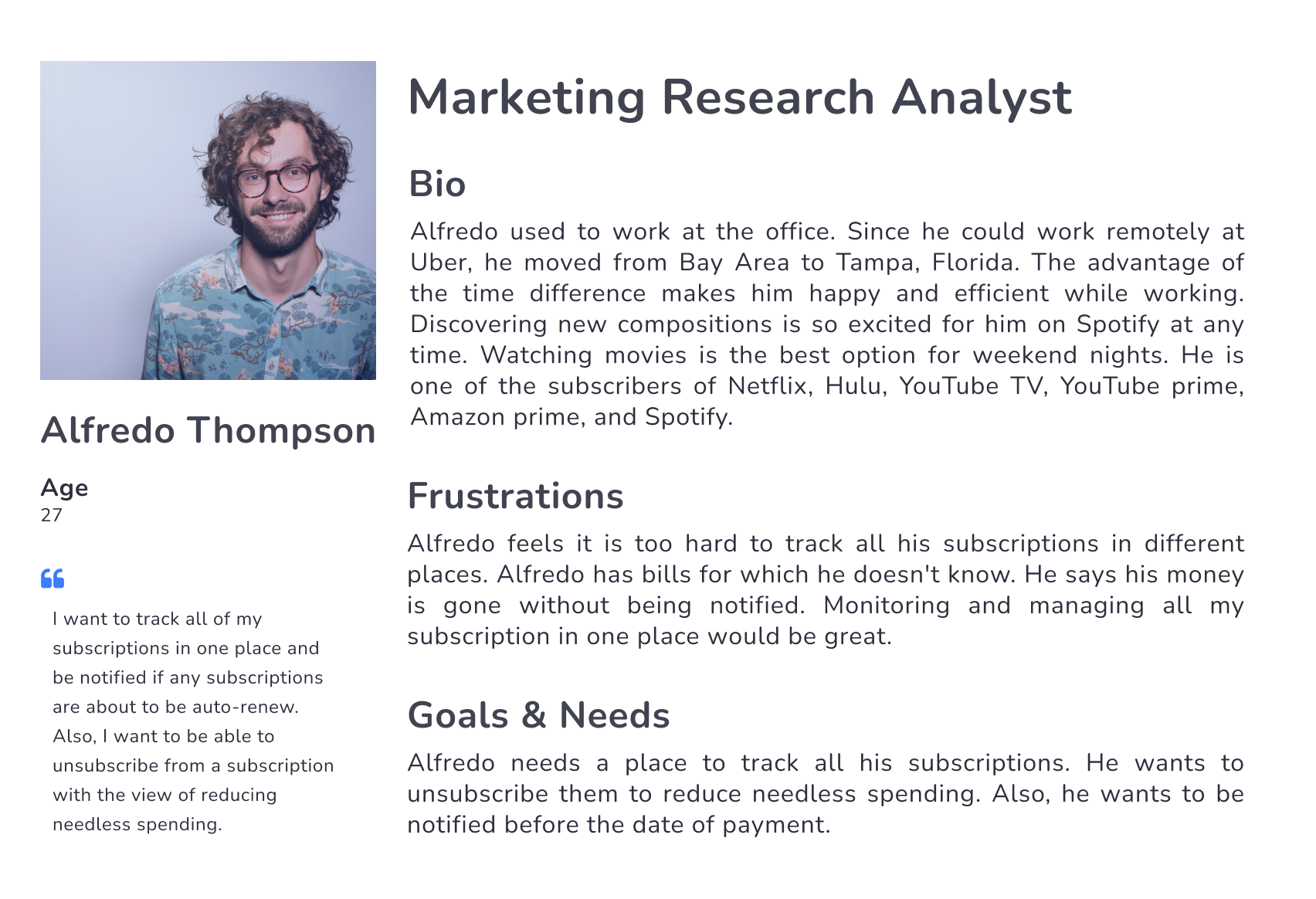
Persona
Ideate
The ideation stage helped me generate ideas to solve that problem. Creating user stories was the first step to understanding what they can do with TrackSubs.
User Stories
With the TrackSubs app, users can track their subscriptions. They can see their monthly payments and what their upcoming payments are. As a user,
- Alfredo can add his bank account to find his subscriptions automatically from his transactions
- He can also add his subscriptions manually
- After adding his subscriptions, he can filter them by their categories, payment cycle, amount, and payment type
- He can choose a time to be notified before the payment date of subscriptions.
- Also, he can see what his expired and unsubscribed subscriptions are
User Flows
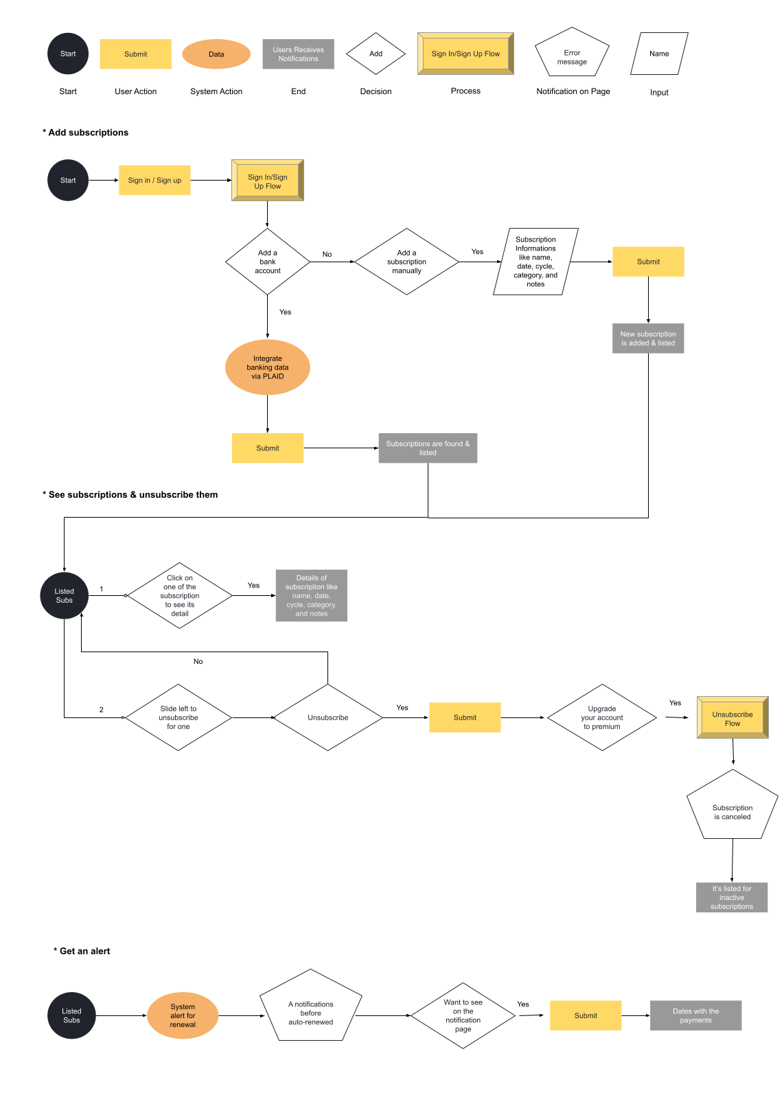
I created user flows for adding subscriptions, unsubscribing them, and getting notifications to get closer to my solution.
Wireframes
Wireframes helped me to create my screen skeletons based on my user flows. After creating a prototype for low-fidelity screens, I conducted 3 remote moderated-usability testing to see if the experience met the user expectations. I found some key insights from it.
1
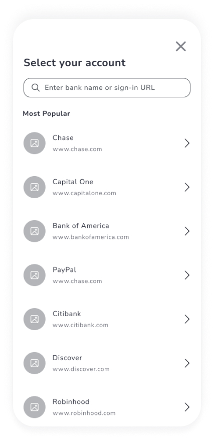
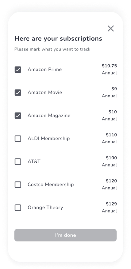
One of my users said, “What does URL mean?” She got confused and didn’t prefer to enter the URL of the bank. She thought the app doesn’t work with the other banks.
2
One of my users said, To unfollow some subscriptions didn’t make sense for her. So, she wanted to track all of the subscriptions together and check where all her money is going.
3
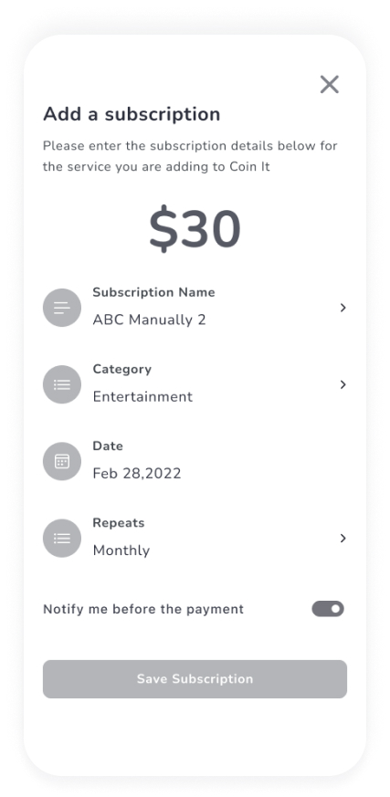
Two of my test users didn’t like the “date” label and they suggested it could be changed to “Renewal Date”.
4
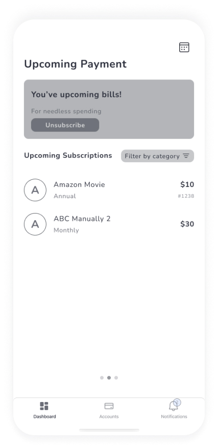
They couldn’t figure out that the page was scrollable. Two of them also didn’t like the buttons on the top of the left corner for actions like unsubscribe
5
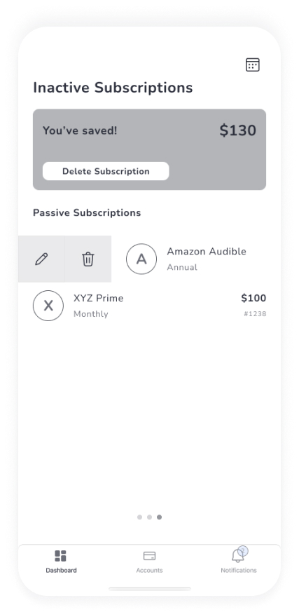
Deleting & unsubscribing were confusing for users. They would prefer to unsubscribe versus delete.
6
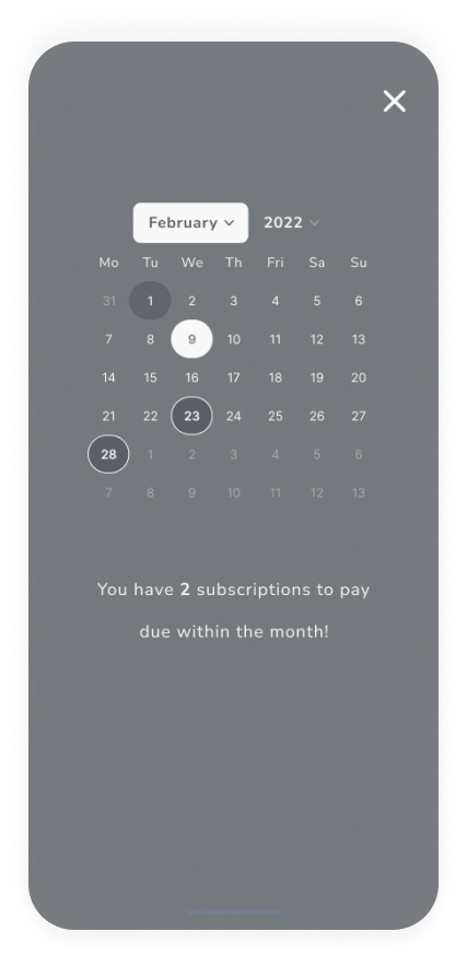
They liked the calendar features but they didn’t understand what the circles represented.
Design
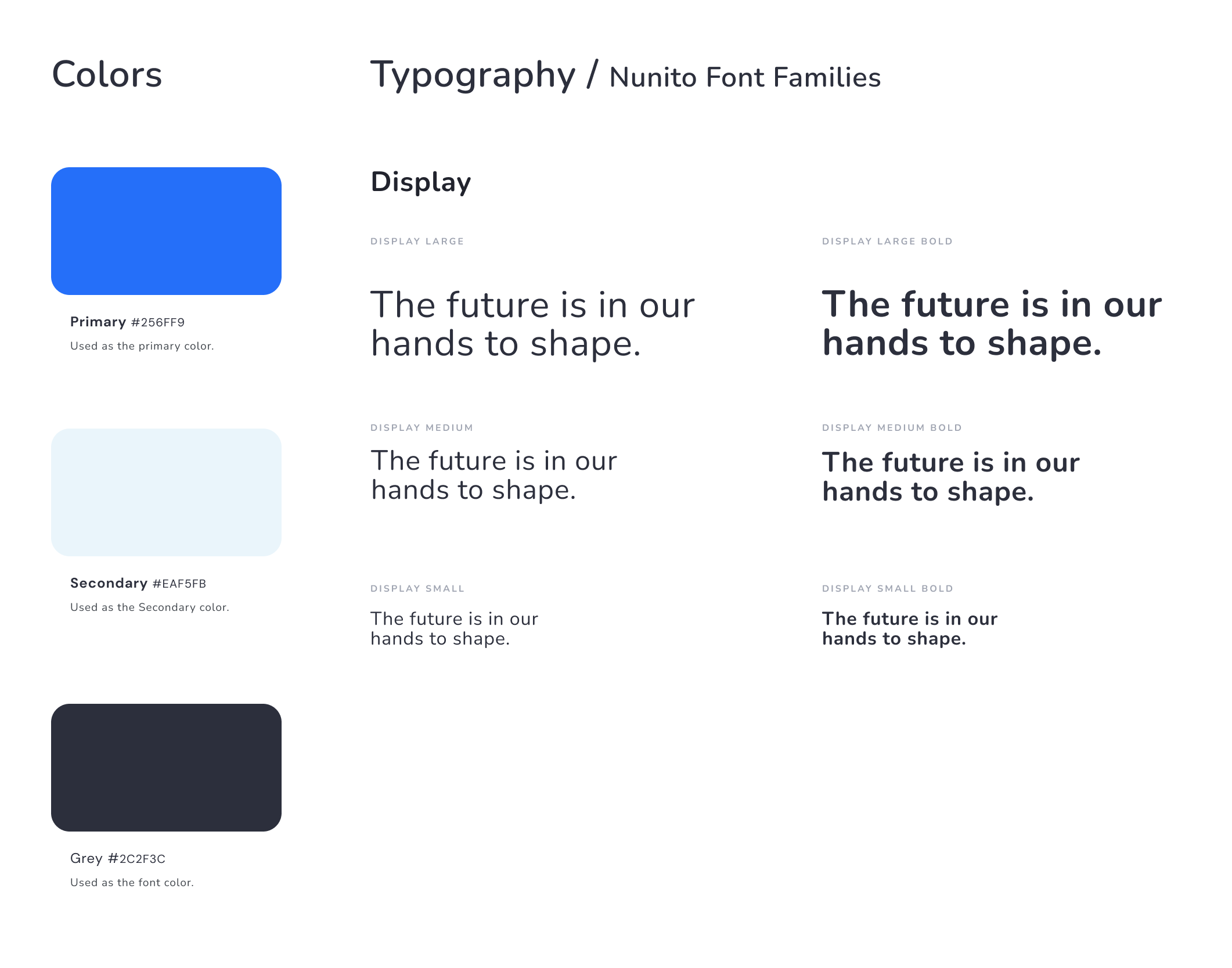
I created a brand name and decided on the color palette, fonts, and style of UI elements that best align in the design phase
- The logo was designed to be simple and easy to understand
- TrackSubs’s typography relied on clean-looking font families to convey simplicity
- I chose blue to represent the meanings of trust, loyalty, wisdom, confidence, stability, and faith as a primary color. It is highly used among banks and financial institutions
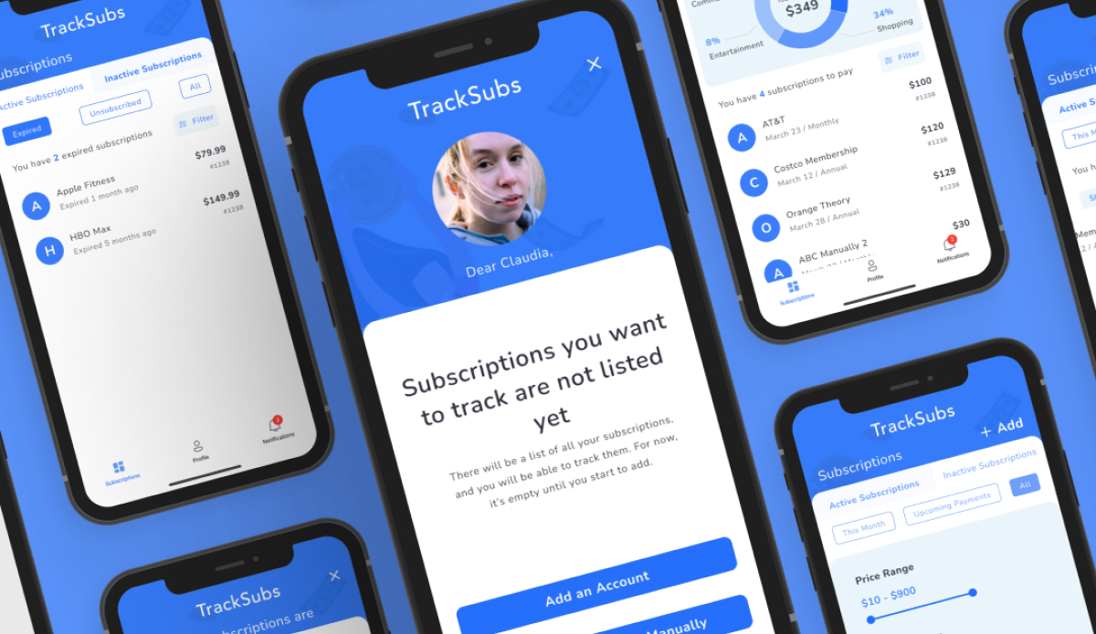
First Version of Screens
According to key insights from my wireframe prototyping testing, It was time to turn bad experiences into smooth experiences for users and add colors to them.
After the key high fidelity screens were created, they needed to be tested by actual users. I conducted 1 round of 1:1 remote moderated usability testing using the prototype with the above HiFi screens with 5 participants. As a result of these tests, generally, they liked what I have done. Some of their expectations were different from what I designed. They gave me a good feedback which I really appreciate.
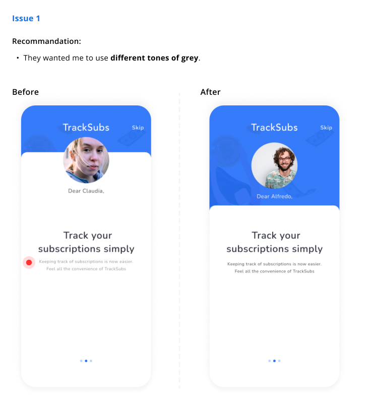
- For 2 out of 5 users, found it was hard to read the text with the gray color.
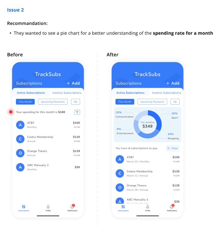
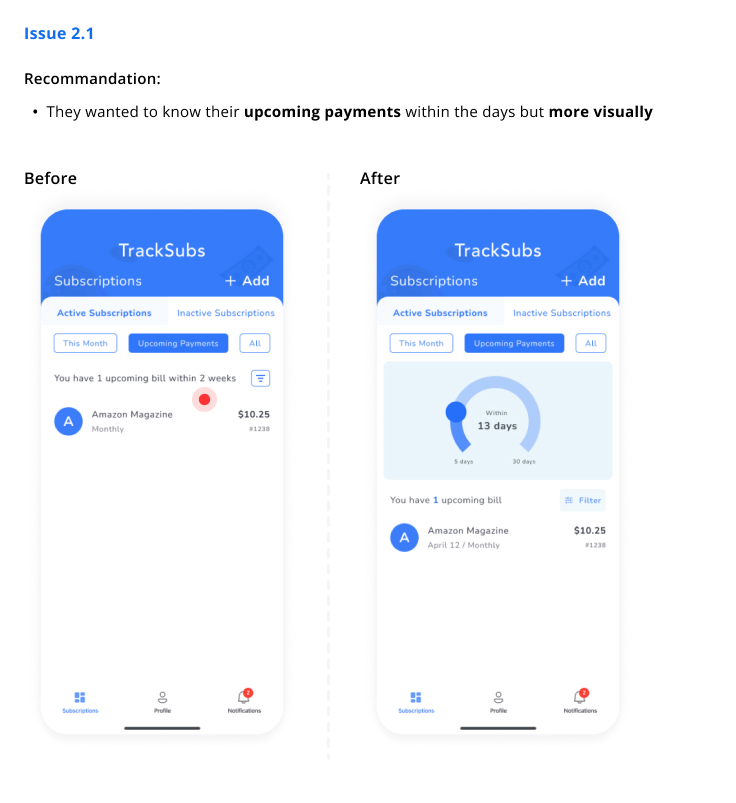
- There was no information for spending rate by categories and they were not able to choose days for upcoming payments
-
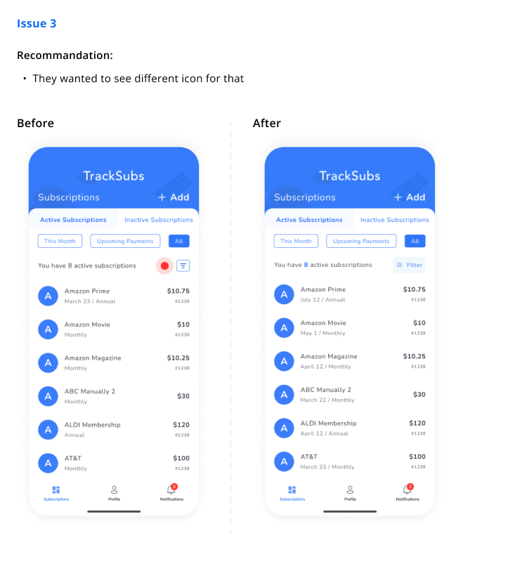
Some of them couldn't figure out what the filter icon was for. They thought it was for
sorting
-
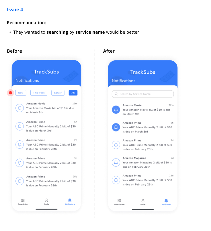
Filtering by time period was unnecessary for some of them but they suggest to me
searching by service name would be better
-
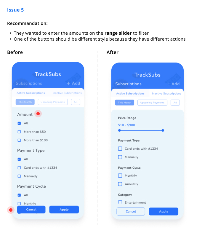
For 5 out of 5 users, found options for amount/price was not enough. Also, some of them
thought that buttons looked the same.
- They said me they would never want to upgrade their account to premium for the unsubscribe process.
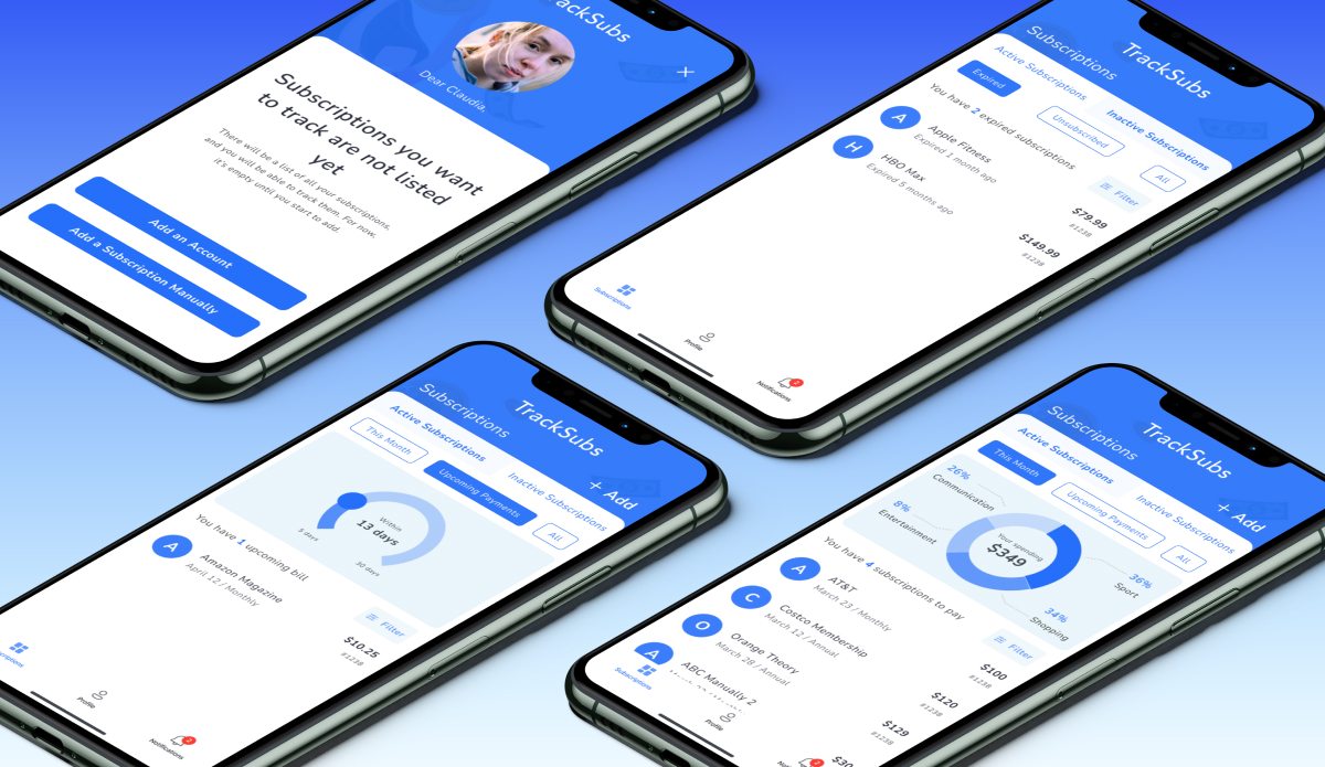
Final Screens
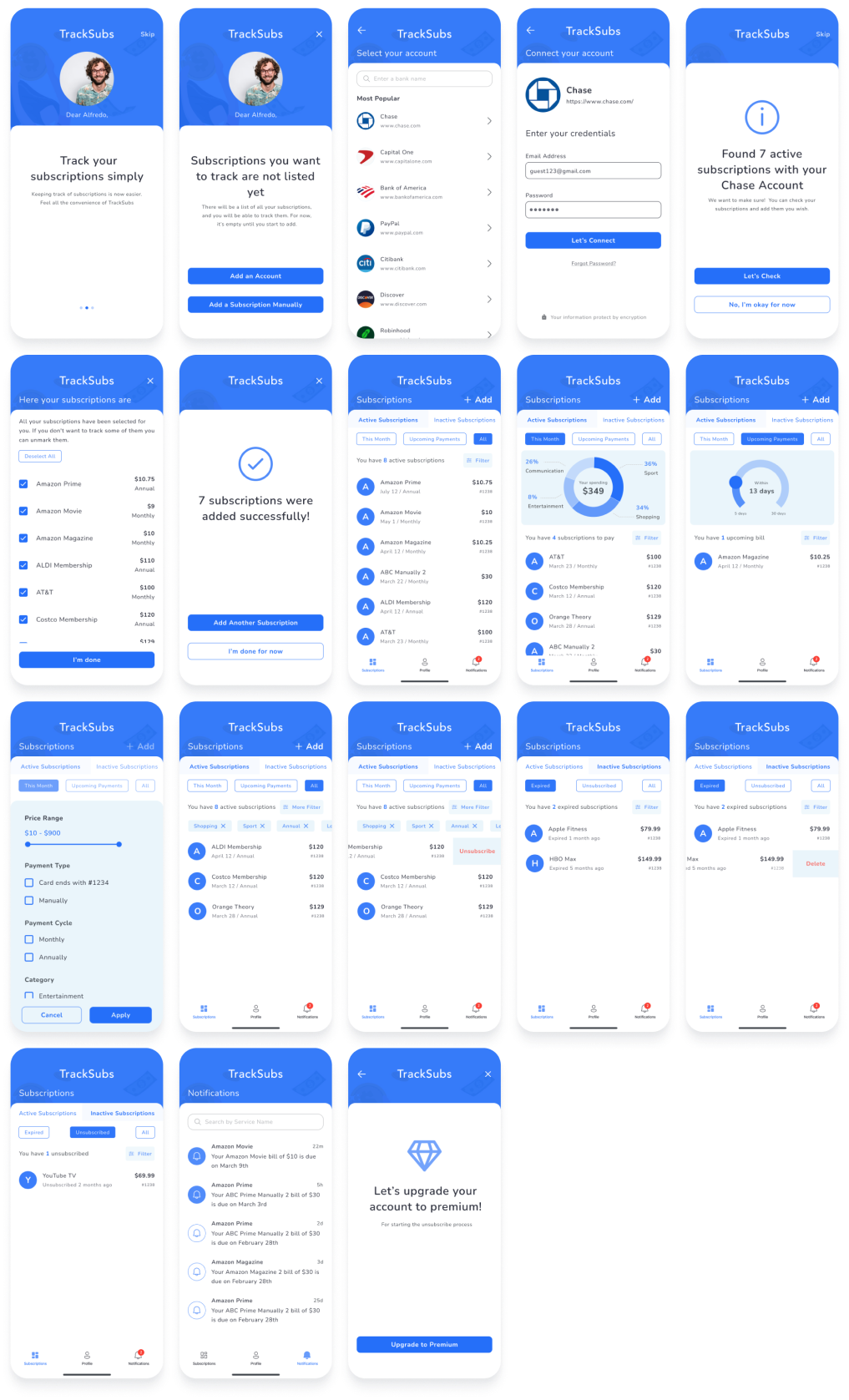
Prototype
A final hi-fidelity prototype was created that took into account all the research, testing, and visual design work completed over the course of this process.
Impact
One of the most important lessons learned was a small change can make a big difference to user experiences. They don't want to see unnecessary details on screens. Putting lots of information on a limited screen was a little challenging for me. I believe that this application can develop with better visuals like a more colorful pie chart or a better layout. I tried to do it with the best functionality.
When I interviewed participants, I learned a couple of things.
- First, they wanted to associate their manual subscriptions with their accounts later.
- Some of them would like to search for their subscriptions. I would love to add a search tab to the tab bar.
- Nobody wanted to upgrade their account to premium to unsubscribe from a subscription. They said, "I prefer to unsubscribe by calling, visiting their website, or on its application." I could direct them to the service's website or application to unsubscribe from a subscription for free.
