Loved Recipes
- Category: Mobile app design
- Duration: 6 months
- My Role: Sole UX Designer
- Design Tool: Figma
Introduction
Sometimes, We find a recipe a recipe spontaneously on Facebook, Instagram, and YouTube and save them for cooking later, or we google for specific recipes. In both ways, we may have difficulties finding to cook them again. My goal in designing the Loved Recipes mobile application was to help users to save recipes in one place instead of on different platforms.
Problem Statement
Problem
As the coronavirus pandemic pressed on, people have settled into routines that involve a lot more home cooking. Hence, we - at least my friends and I found ourselves cooking more recipes and keeping them. If you have too many recipes you keep, it's hard to remember where they have been saved. Was it on our phone, on a piece of paper, in the chat, or on your YouTube collections?
Solution
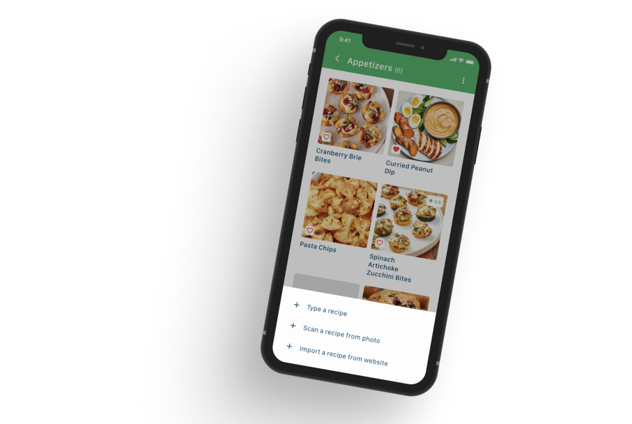
I designed an app where people can add/save recipes by typing, entering the link of recipes, and scanning a recipe from a photo into this app. Also, they can look for recipes that they have saved to find them easily in this app.
I chose my participants who cook at home and collect recipes. I followed a design thinking process that includes discovering, designing, and validating. Let's get started with the discover phase which includes empathizing.
Research
Discover - Empathize
To get more information, I did secondary research which involves exploring existing data that relates to recipe apps on Google. I found similar applications downloaded by people, and I looked for their ratings on Google Play and Apple Store. Also, I did competitive research to know how other similar applications solve this problem. I tried to identify their weaknesses to make my product stronger. After that, I created a research plan to follow my design process. According to this plan, I prepared a screener survey with ten questions to interview the right person then I conducted interviews with five of them. I learned how they prefer to save recipes. According to my research, I created affinity and empathy maps helping me to build two of my personas. Then I could synthesize my research.
-4.jpg)
.jpg)
Personas
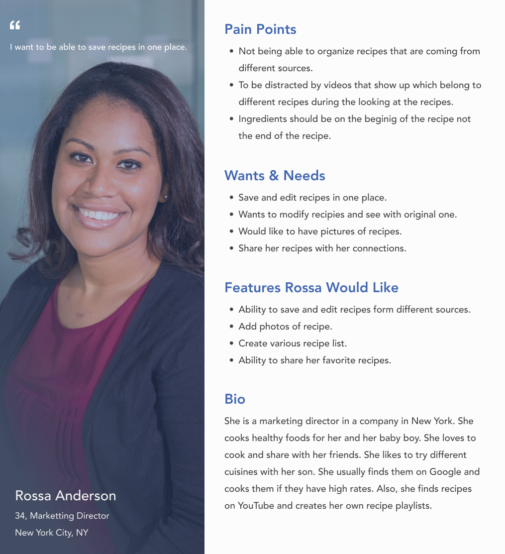

Design
Define & Ideate
When It was time to design and ideate, I started to draw my solutions on paper by answering How Might We (HMW) questions. Then, I created ten user stories to identify the functional needs of my product. According to the discover phase,I created an app map that led me to user flows for the minimum viable product.

One of the most exciting steps was creating my three red routes that are flows for login, search, and adding recipes from different sources. To get initial feedback on the screens I’ve sketched, I conducted Guerilla Usability Testing with five participants. Guerilla Usability testing is a quick, cost-effective way to learn what users like about your designs and what aspects of your design are a bit less intuitive.
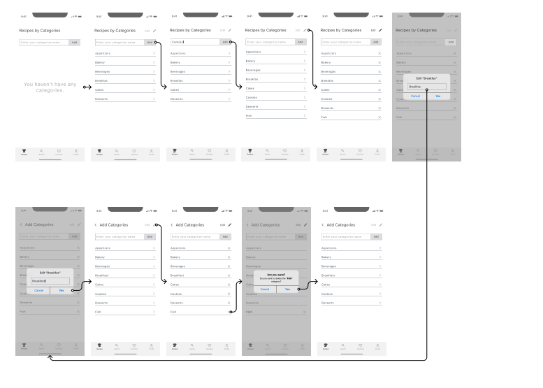
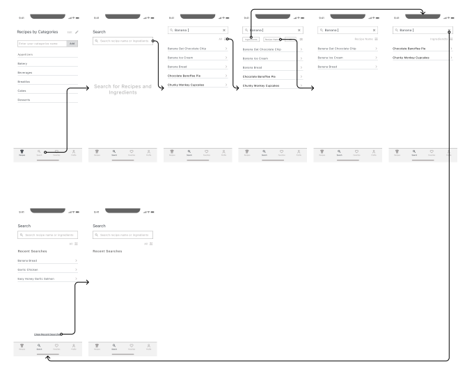
Following Guerilla Usability testing, I started creating low-fidelity screens - wireframes for my three red routes which including edge cases. I have applied wireflows to organize them. Here are some examples;
Design System
Validate
Prototype & Test
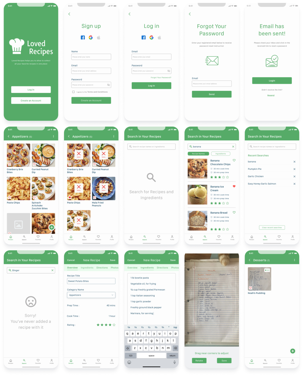
This was the most enjoyable phase for me. In this phase, my designs were getting closer to a real application. After completing high-fidelity screens, I prototyped and animated screens on Figma. While doing it, I used the Interactive Component feature of Figma, it took my time a little but it was fun. To be prepared for my usability testing, I created eleven tasks to ask participants. It would help me to see how they react when they interact with Loved Recipes and learn about their experiences. Tasks are;
- Create an account
- Add a category name
- Edit a category name
- Delete a category name
- Delete a recipe in the appetizers category
- Search for recipes and ingredients
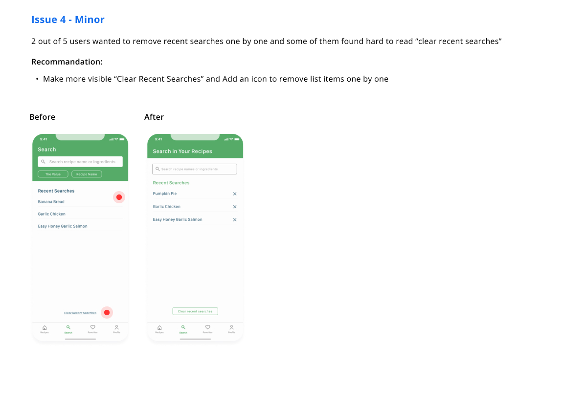
- Clear all recent searches
- Add a recipe by typing
- Add a recipe by the link from a website
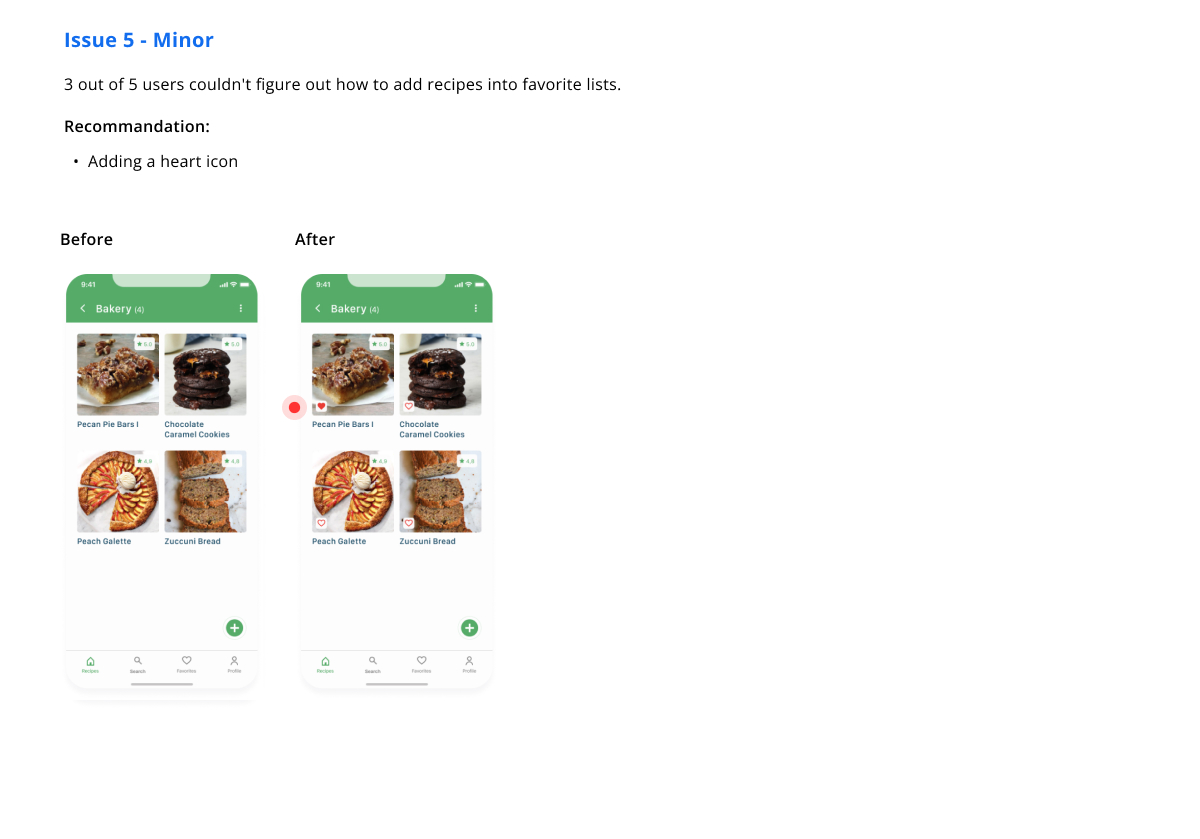
- Add a recipe to their favorite list
- Add a recipe by scanning a photo
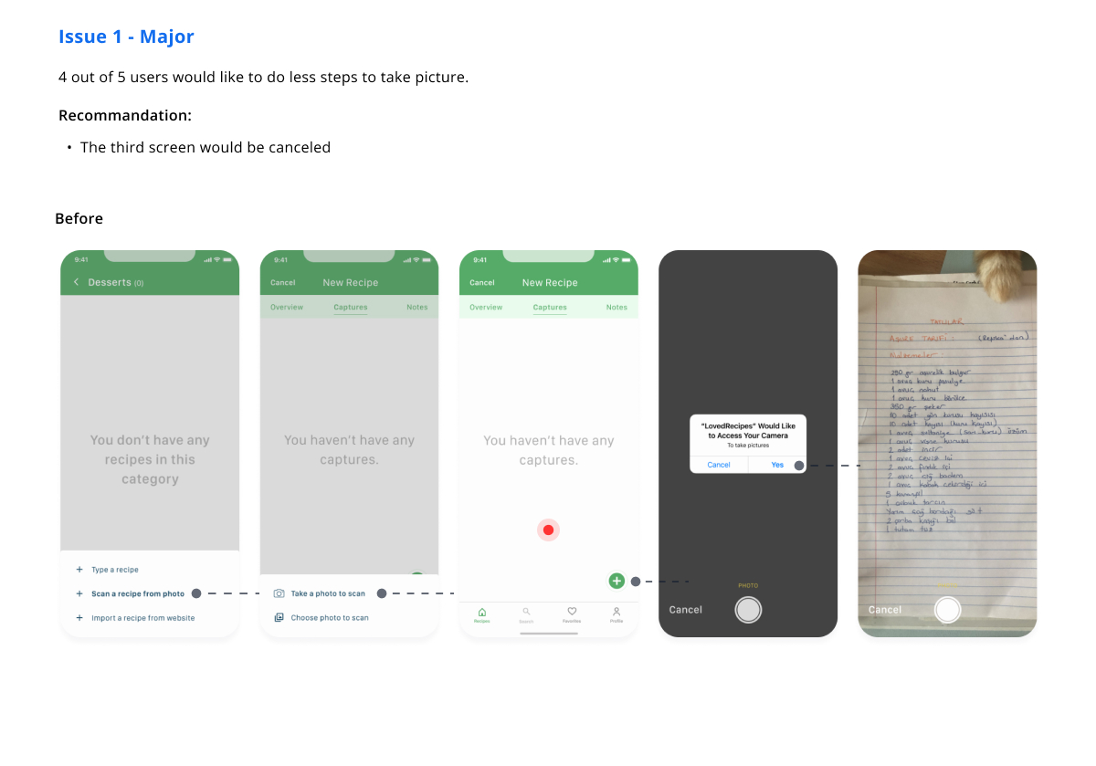
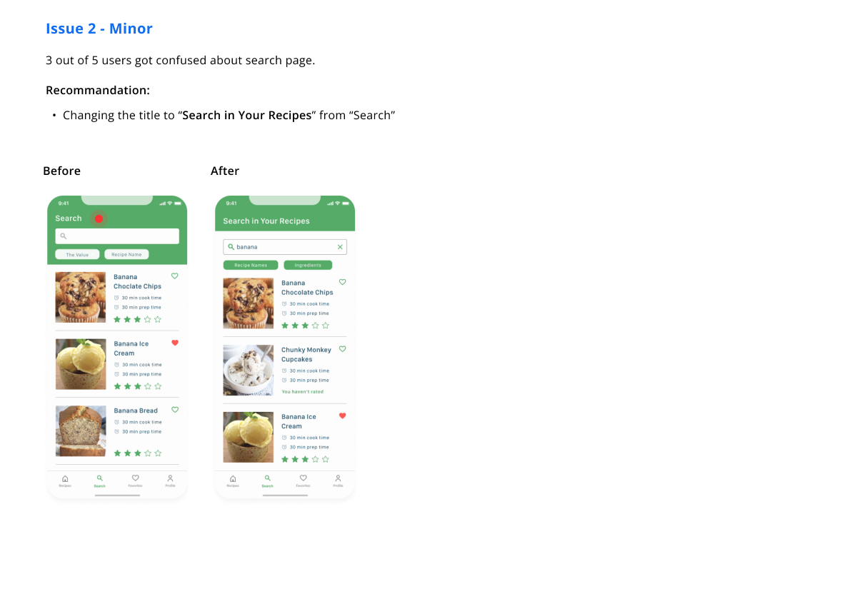
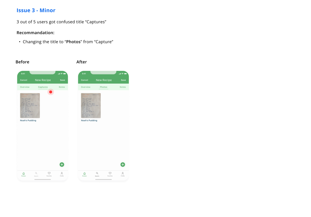
I conducted moderated usability testing with five participants remotely. Here were things that I improved after the first usability testing.
Following the first usability testing, I synthesized and redesigned related screens to fix issues. I conducted another five interviews for each session was 30 minutes. I haven't heard any critical errors. Participants completed the tasks, creating an account, searching for recipes, and adding recipes by typing, scanning, and linking. Overall, they liked the Loved Recipes. They said it's easy to use, and the Loved Recipes is consistent. That's what I wanted to hear. As I mentioned, I used the interactive components feature of Figma, and I loved it. You can find it below.
Final Screens
Reflaction
The Loved Recipes was my first time working on a full-fledged design project using the design thinking technique. Creating wireframes and low fidelity screens was a big step in the beginning, but it was valuable for me. It made my ideas tangible and helped me to create a skeleton of them. Developing creative answers was a thrilling experience. Overall, the project was a great introduction to design and a fantastic learning opportunity.
Challenges I faced;
What's Next
I would improve my designs according to my participant's wishes.
